Linggo, Marso 3, 2013

Flower Power- Nature Photography Made Simple

As the wanting of photography is growing on me, I have to asses which type of photography would I choose that would really make me feel as if this is "it". Its like going to the same coffee shop or  restaurant everyday. Though you may choose a different type of coffee or order another menu the next day, after a while when you get the hang of it, you do have in your mind the menu or the coffee that you enjoy most. The same goes with music preference, fashion preference, art preference, partner preference and so many other preferences in life. Many of us choose to settle with the one we are most comfortable with and that helps define who we are.


As an artist, I've always liked colors, the vivid colors of summer and I remember when I was a little kid, I had a lot of fascination for nature. A cousin once called me "tree huger". So its no surprise to me that I was fascinated with natural views but its kinda frustrating (to me) that we live in some suburban town and there's not really much room in there for natural beauty. I know, some people out there would imagine a scene out of a National Geographic or Discovery Channel program with stunning visuals and everything-the works but that's just not feasible since I'm no pro and never mind the the budget to travel far away and the equipment they have to capture such stunning imagery. We had road trips a few times but we don't always stop just for me to capture the best scene and my digital camera (like most digital point and shoot cameras) has a low dynamic range and you can't get the best picture from afar.

So what I did was try and capture subjects at short range and since my camera is 14 megapixels, the results were actually very good, paired up with Kodak's Ektachrome color mode that gives the images a warm vivid feel. I tried taking shots of flowers we had in our garden  at close range and I was impressed. So I decided that I should just exploit the little things around me and try to make the best imagery out of flowers since they are widely available close by and are pretty colorful. I consider myself a "flower child". I made this Windows 7 theme, featuring my flower power photography. Flowers of the Seasons Themepack


Yellow Bouganvilla

Pink Bouganvilla
I take shots at point blank range as to eliminate much of the not-so-pretty background that would distract the look of the subject. I'm no expert but I do gauge the best angle to take the shot and well, the results were stunning, even when zoomed.  They call it "rule of thirds" in photography. I showed those flowery pictures to  a few people and they were impressed, well impressed of the camera's ability. 


Roses
Occasionally, I wouldn't zoom at them too close and that is to allow the background to support the main subject or show other potential subjects but it must still have enough composition to expose the main thing more than anything else. Sometimes, there could be multiple subjects like the picture of the roses. Naturally, their bright red color would be imposed over the gray color of the concrete pavement.


Yellow Bells
Since our garden isn't very grand, I take picture of other people's plants too. The trees behind the yellow bells was to try and make it look like as if it were taken in a forested place plus the sky was to add more drama and give it that summer feel. I took these pictures on a sunny day with the good ol' sunlight bringing the perfect lighting so  these flowers would have the best of their color. I call that summer magic.


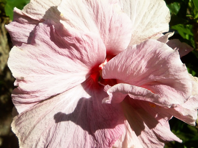
Gumamela


I also experimented on cropping the images to eliminate all the distractions and expose the texture of the flower so that its full beauty will be revealed. I always set my camera to the full 14 megapixel capture mode to achieve this.


Ixora
Another stuff I came up with was to flood the picture with floral beauty. This applies if the flowers are too small and would have too little detail on their own. This is the case with the ixora flowers that we call santan.


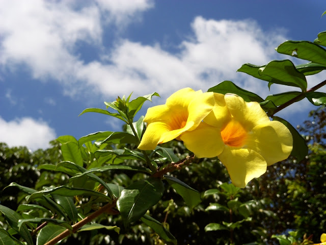
Yellow Bouganvilla
Distractions sometimes help too but they usually have to be blurred. I got these leaves and twigs closer to the lens of my camera than the yellow bouganvilla but good thing my camera auto-blurs them. It also auto-blurs the plants behind the flower. The yellow-green color of the blurred leaves actually enhance the picture cause it masks the otherwise dark spot behind it. I can imagine this shot not being as good if the blurred out leaves weren't there. I took this early in the morning and it may look like as if this is some wild flower cause there's clearly no man made thing lingering around. This is one of my favorite shots ever.


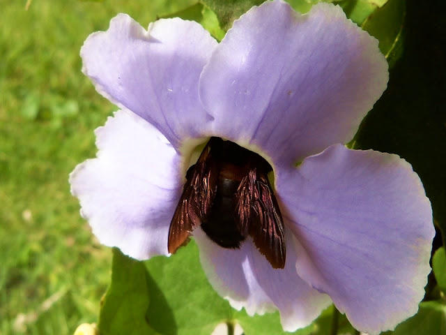
Bee on a flower
Of course other seasons, even on a tropical country like ours present new things. In this case, spring provokes insects to come out. I was in a backyard of some building, I happen to have my camera then I saw this bee trying to absorb nectar from that flower so I creeped slowly from behind and took this shot. As a rookie photographer, I felt as if its my lucky day! I posted this online and some guy said it was captivating.


Of course, its also fun to take pictures  of flowers after a rainy day cause water droplets and moisture add more art into their delicate texture. We've seen pictures and wallpapers of moisture on the surface of leaves and flowers that were zoomed many times but that's just beyond what my camera can do. Those were taken by professionals with high power DSLR cameras with those fancy lenses that can blur everything around the focus. Polishing and retouching with Adobe Photoshop even makes them more pro. Another difference here from those shots taken on sunny days is the lighting. One simple trick I do is take the shot of the flower against a background with darker color and I do not use flash with that cause that would ruin the natural lighting in many cases. The color of the flower is still well imposed over the background. I took inspiration from the Dreamgarden Theme   found in Microsoft's personalization website where the flowers don't have much exposure to sunlight.


In some cases, I thought that the green leaves behind would just drown the color of the flower. I solved this either by lowering the picture's tint (that eliminates the green a bit and adds more magenta) or by using the color curves tool that has a graph where you can manually lower the RGB colors. I this case, I lowered the green a bit, increased the blue (that makes the leaves bluish) and the red (adds more emphasis on the orange). I now use Paint.NET and Photoscape to make these adjustments. Photoshop of course has similar tools to achieve the same effect but are found deeper down its inventory and its generally more resource-consuming.

So that wraps it up. Even if you have limited tools like myself, try and experiment on the little things you can find close by. You don't need to have the best kit or travel somewhere to be a good photographer. Its true, it all goes better when you travel somewhere with a better camera. You get to have a much wider range of subjects, add  more experience under your belt and bag more memories along the way but we all start small. Look around you, look at the little things, pause for a moment and think of a way you can appreciate them better and you might just discover the simple yet essential things. If life gives you limited options, make the best out of it!


Sabado, Mayo 5, 2012

Retro Art

If you drink lots of soda, have you ever noticed that the label text of Coca Cola never changed? Some design layouts and bottle design  might have changed but the "Coca Cola" text you see has never changed. The label text itself is like a company icon and they have preserved it that way for many decades unlike Pepsi. That is an example of retro art. Retro, from the word "retrospective", meaning backwards. To put it short, its art inspired by those you see by going backwards in time, not really going back to Da Vinci's or Van Goh's times but by going back to the mid 20th century. It gives you that classic feel like if it was done decades ago. Some retro arts have become iconic that's why companies like Coca Cola decided to keep it that way. Retro is colorful from how I see it and even today, Retro art printed on fashion merchandise are widely popular.


 Retro Art and Advertising

Wartime Posters
American Wartime Posters


American advertisements in the 40's and 50's are basically retro art in today's terms. The people you see in those pictures basically wore the fashion back in those times when television was young and usually black and white. Even wartime posters and propaganda contain retro art but the advertising and propaganda efforts back then gave more emphasis to 20th century arts like "Pop Art" and also made this a classic even today.


Coca Cola Advertisements


I chose Coca Cola as an example because of its long history in advertising. It had several examples of Retro art like Santa drinking Coke and cute smiling girls from the mid-1900s. Notice they used the same text label design back then.


Campbell Soup Can
Campbell Soup Can


Another example is the Campbell Soup can designed by the American artist, Andy Warhol who made a reputation in the Pop Art Movement. Artists in those times used designing talent rather than Photoshop which they didn't have.


Psychedelia and the Famous People Featured on Retro Art

Fashion today has a huge variety in terms of design, style, color, subject and message. Some of us who were born on this later generation can't help wonder why we see pictures of unknown people on shirts, caps, bags, etc. One thing we do assume is that these guys must be famous or have done something iconic in the past. Fashion preference to me is an expression and whenever you wear something with some famous person's face in it, it appears as if it brings a lot more meaning to what you want to express even if you don't intend it to. Some might even consider that a plus into your awesomeness factor.  Colorful or psychedelic shirts are still on the hip today.


Jimi Hendrix
                                                              Jimi Hendrix
Back in the 60's, when rock music psychedelia, along with those peace-loving, flower power hippies were at their peak, psychedelic art was born. Its characterized by colorful arts, mimicking the effects of LSD and other drugs at that time. Famous rock musicians like the great guitarist, Jimi Hendrix and The Beatles were featured on psychedelic art.  


The Beatles
The Beatles
The Beatles was a symbol of the cultural revolution in the 60's.Pictures were taken of the four Beatles that were made into colorful psychedelic art. Variations on this design also appear somewhere. The famous cover of their album called "Abbey Road", shows them crossing a zebra road was also imitated a lot even on The Simpsons cartoon.

Abbey Road
The Beatles on Abbey Road


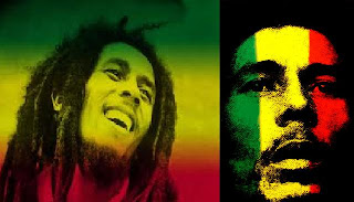
Bob Marley
Bob Marley

Another one on my list would be the iconic symbol of Rastafari and Jamaican Reggae music, Bob Marley. Not only does he inspire people to wear dreadlocks, he is featured on a lot of clothes and accessories, decades after his time. I've seen the "three colors" theme; red, yellow and green on bracelets, bonnets, shirts and other accessories today.


Che Guevara
Che Guevara
And lastly, "Guerrillero Heroico", the famous photograph of Ernesto "CheGuevara who is a famous symbol of rebellion was simply a masterpiece. The cropped portion of this photograph can be seen on an infinite number of shirts, caps, bags and so many other merchandise. I knew a guy back in high school asking who Che Guevara was. I told him he was famous for a rebellion. He thought that Che was a "rock icon". So now you see how much people would look up to iconic people they see printed on shirts that they don't even know of. But its not only the musicians who got into this status of a cultural symbol. Retro or lets say "pop art" helped make these people known in today's generation.


Disco Influence and the Modern Adaptations of Retro Art

One of the characteristics of Retro art I've seen is that some feature colorful grooves like a Disco theme from the 70's often with stereo speakers and discs. The design is somehow linked to music.


Modern Adaptation of Retro Art


Jimi Hendrix printed on a shirt
Pictures of Famous people at a diner
Here is a shirt I saw displayed on a boutique shop. Its an image of Jimi Hendrix, a legendary  lead guitar player from the 60's.


Now here's a collection of some famous celebrities from the past displayed on the wall of a diner. Shown here are James Dean, Marilyn Monroe, Elvis Presley and The Beatles. The diner decided to incorporate a retro theme to their design layout and they did great with that.


And to keep up, I also did some Retro arts featuring some of my friends and they liked it. I used a free program called  Photoscape and MS Paint for this and it turned out well. I designed them to be colorful.


Expression helps define who we are be it views, words, music, art, thought or belief. Some people who have become famous, even decades after their time are still used and depicted as cultural symbols. They are also subject to art and fashion. Styles and people of yesteryear have stood the test of time and they still inspire modern artwork and creativity. So if you want to aim for something, aim high and you might just become an icon.

Sabado, Abril 28, 2012

Pixel Arts with MS Paint

Ever got bored with the computer? I know that I did, a lot. There are just those frustrating times that I just could  not do anything productive that I needed to put my focus into something. I wanna try out something new with art and what I could do with a Windows computer. That brought me to pixel art.

So what really is pixel art? From the word pixel itself, you make it using a program that generates pixels. Its those tiny single-colored square dots you see when you zoom a picture on your screen that has different hues, colors that actually build up an image when put together. Since I'm no expert with Photoshop, I decided to test the limits of what I could do with MS Paint.Its an underrated preinstalled Windows program but once you learn it, its cool. Someone even made a tutorial of it in his blog not to mention all those other fancy MS Paint tutorials on Youtube. OK here goes.


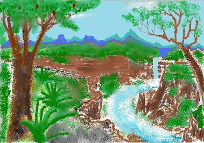
Jungle Pixel Art
Pixel Art using Vista's MS Paint


 One of the first ones I did was this. I know, it may look like a kid's drawing but it took 2-3 hours of my life to do this. I was using the MS Paint on Vista. It had less coloring tools to deal with than the Windows 7 version and I admit I was still a newbie at that time but at least its original imagination.


Moonlight over Sea
Pixel art using Windows 7's Paint


When I got my Windows 7, it didnt take long for me me to learn to toy with the new MS Paint. It had more tools. One of my favorite is the crayon tool. I toyed with it and I got this.


Moonlight over Sea polished
Pixel Art after more tweaks and Photo! Editor
I discovered this free program called Photo! Editor. It has this "makeup tool" that smooths, mixes your color plus remove blemishes too. I just used it to smooth this background so that the colors will mix and get more refined. Its a great program to begin with if you are not skilled with Photoshop like me. This came out and its fantastic because I wasnt using any program with very high technicalities. I used only MS Paint and Photo! Editor, very limited programs but sometimes you can do something its not designed to do but it can do.


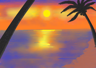
Sunset over Beach

I find it easier to experiment with scenes, such as sunrise, sunset and with more exploitation of Paint and Photo! Editor, I was making more. Again, the nice crayon tool made a great effect on those coconut trees.


Night Forest


I love to draw with pencils and now I experimented only with black and gray hues and I came up with this idea. I also used the airbrush, used different hues with the darkest ones at the bottom and it turned out well as an emulation of a pencil or charcoal drawing.


A guy from Youtube uploaded a video of the updated version of his pixel-made world from MS Paint that took years to complete. Its like a whole kingdom of pixel-drawn characters. Its now a very huge image but such a great demo of how pixel art can be customized and made into something that would totally make a new definition. This guy was so dedicated and to me, he's a genius. There are tons of other examples on Youtube. I learned a lot from those guys.


Spanish Church
Una ojeada en Iglesia de San Martín


Next stuff I did was try to emulate oil paintings with MS Paint and Photo! Editor. Here's a picture of a church cause I was  fascinated with Spanish art that I see on books when we studied our history class, many years ago. Notice the stone blocks? Most of them were copies of just one stone block I painted that I just copy-pasted side by side and here it is. That's the advantage of MS Paint, you got the copy-paste option, no need to get your hands dirty. I called it "Una ojeada en Iglesia de San Martín".


Fruits Drawing
Initial painting with just flat colors.


Fruits Still Life
Completed pixel art painting.
And finally, I tried still life. I got the inspiration of still life paintings from a book I read. Took me some time to do this. It started with flat colors with darker hues to the sides for the shadows, then I made more hues and texture with the airbrush tool. Again, here comes the use of copy-pasting. They are all just copies of one apple and using the rotate option, I made one of them tilt to the side. I  made heavy use of the makeup tool in Photo! Editor to blend the colors in the background.


As an artist, there must be flexibility to your works. Always good to experiment on something new, use new ideas, new tools and new subject, then you get a new form of art. You don't need to be a virtuoso, no need to be in art school, just be creative,dedicated and wise. No need to be complex, learn to use the things available and you might just get some reputation to it. I'm sure all people had different ideas. What matters is how you convey them.


Huwebes, Abril 26, 2012

My First Favorite Shots

Since I got my new Kodak camera, all I wanted to do with it was to grab a picture of some great views. I don't enjoy taking pictures of people who have purposely posed for the camera with all the smiles and gestures unless if someone I really liked was on the picture or if they asked me to do so . I prefer stolen shots because I believe stolen shots give us more realism of what's really happening. There's also more story and drama to what's on the picture but that's just from my taste of photography
Kodak M577 Camera


The camera I have is a Kodak M577. It packs a 14 Megapixel resolution and has a customizable color mode as well as preset color modes. I love to use its Ektachrome and Tri-X color modes. It can also take HD videos.


These are my pictures at Sabang beach in the Camarines Sur province. I used my favorite Ektachrome color mode and it came out like this. It was a sunny September morning that my dad and I went there. It was a perfect day for taking these shots and its really mind-widening when you look at those views from afar.


Glittering Sea
The beach and the sand are spectacular early in the morning. The calm waves, the fresh air...wheeew.. it sets your soul free. To some people, it simply opens the thrill for travel and adventure.


Fishermen
When I take "stolen shots", I wanted them to come up like this. I mean, you capture this moment in time that you could describe in a thousand words. Its like something you get with photojournalism or from a famous painting because you simply capture the drama of the scene of what these fishermen are doing that simply has more to tell of how people here live.


Sabang Paradise
 Its amazing to look at this view, the blue waters, the blue skies, those green mountains on the side- its simply a tropical paradise. Good thing its not far and its a privilege its still there.


Colorful Boats
 The colors on those shipping and transport boats as you could see, perfectly harmonizes with the calm background of the sky and the water.


Sabado, Abril 21, 2012

Weird Pictures

When it comes to photography, some clever people became inventive enough to go beyond the traditional. I like to imitate what they do sometimes because I believe they become more interesting than normal pictures. Some of these images were done using techniques possible with an average camera, some were just very lucky shots caught on the perfect moment and some were edited using professional software like Photoshop but hey, you just gotta be creative, not necessarily a professional photographer or photo journalist to gain attention.


Dog that looks like human

The picture of this dog, puzzled me years ago. It had a human-like face. I think it was edited using something like Photoshop but its such a nice job. When I see pictures like this, I think I should take studying Photoshop more seriously.


Pencil on Picture


Here's another good pick -combining a picture with a pencil drawing and with good calculations of perspective, the effect is nice and transitional. I've seen many examples of this. I've seen people do this even with money bills. I wonder whose famous face I could get my own face to fit like this?

Edited old portrait photographs
And we got comic fans who did some experiment with old pictures and their comic heroes. It puzzles me how much some people would put effort to prove their devotion to these characters. 


Whoever came up with this idea is simply brilliant. Its another way you toy with perspective. You don't need any editing software unless you wanna modify color modes to achieve this effect. If I had one word to say to this picture, I'd say WOW...!!

Huwebes, Abril 19, 2012

Why I am passionate about Photography

Passion comes in many ways. Its about what you had fun doing and thinking about. I consider myself a visual artist and a nature lover and whenever I see beautiful scenes with nature, I like to preserve them because they don't stay forever so I thought, photography.... its what I can use to preserve what I see so that I can keep it.

I've been a nature lover since I was a kid and I'm really impressed with the God-given scenes out there. The sky, the ocean, the trees, forests, you could put a lot of words to describe them at one time but the next day, it may not be as what it looked like the day before. Its difficult to explain at first but it gives a refreshing feel to your eyes.


Other types of photography are very interesting to me as well. The angle from which the picture was shot and the places included in the background give different meanings for different people. Modified color variations also add up to the atmosphere that taking pictures on common places suddenly becomes more dramatic than what one would commonly perceive in reality.


Its not only traditional photography. Another thing is that as an artist, I could experiment on how I would take pictures.I was also inspired by looking into lots of sites where pictures become sensible, funny or just plain amazing such as this funny blog where they added humor on the pictures and made them more interesting plus those demotivational pictures are also quite cool. I get tons and tons of inspiration when I look into those sites.